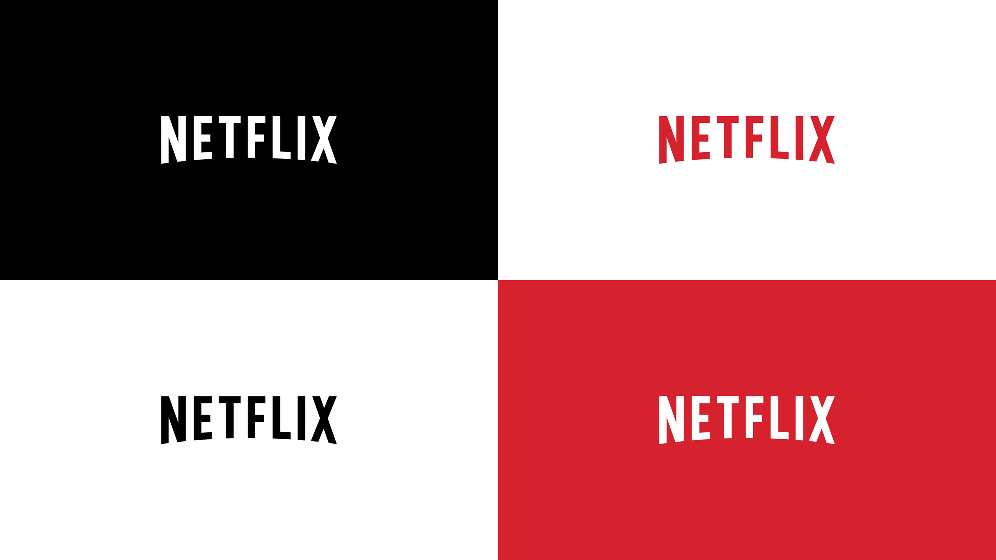
Netflix
Helping a pioneer become
globally iconic.
—
The new identity allows Netflix
to be bold and confident in their communications making them stand out and truly own the content
they create, helping them become the globally leading brand they are known as today.

The Challenge
The Netflix identity had great recall and recognition in the US and UK. As they grew globally so did the number of brand and marketing touchpoints. However, the existing identity ran into challenges when applied to content created and owned by Netflix and was not easily recognizable when used at small sizes digitally.
The Solution
With the insight that the arc in the logo had the most brand equity and recognition, we explored the many ways this could take shape as well as the idea of shadow and light, a big part of the cinematic content they create.
Results
Since the work Netflix has gone on to become a globally leading brand. The new identity allowed Netflix to be bold and confident in their communications helping them stand out and truly own the content they create.


Background
The old Netflix identity had several challenges:
The drop shadow was very hard to render in small
formats and app icons.
The red background was part of the logo
as the wordmark alone was hard to use.
The red background was hard to integrate.
There is no specified shape to the use of the red background, sometimes a red circle, often a rectangle or a stripe of red.
Because of this the identity was inconsistently being integrated into product, content and marketing, effecting the strength and recognition of the brand.


