Netflix
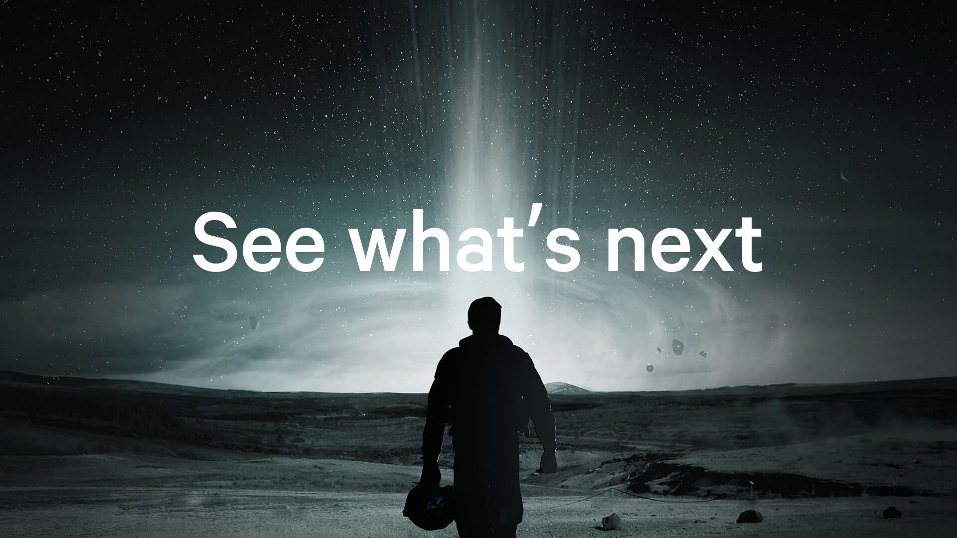
Helping shape a pioneer for the future of entertainment.
Brief
Netflix was evolving from a DVD-by-mail company into a digital platform, with a very different future ahead of it. The brand needed to move with that shift, becoming more scalable, more distinctive in digital environments, and better able to connect with the entertainment experience it was creating.
My role
As Creative Director, I worked with a small Netflix team and the founders of Moving Brands to help shape the future-facing identity. The work spanned strategic framing through to the practical demands of a system that needed to perform clearly across digital product, communications, and a growing global brand presence.
Thinking
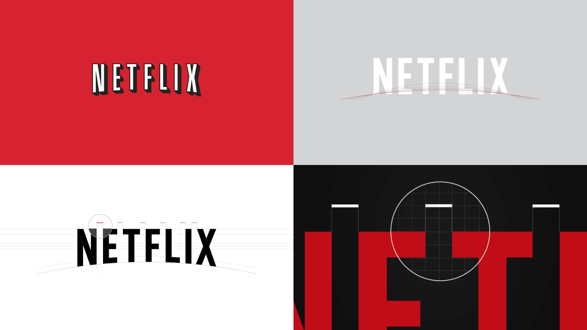
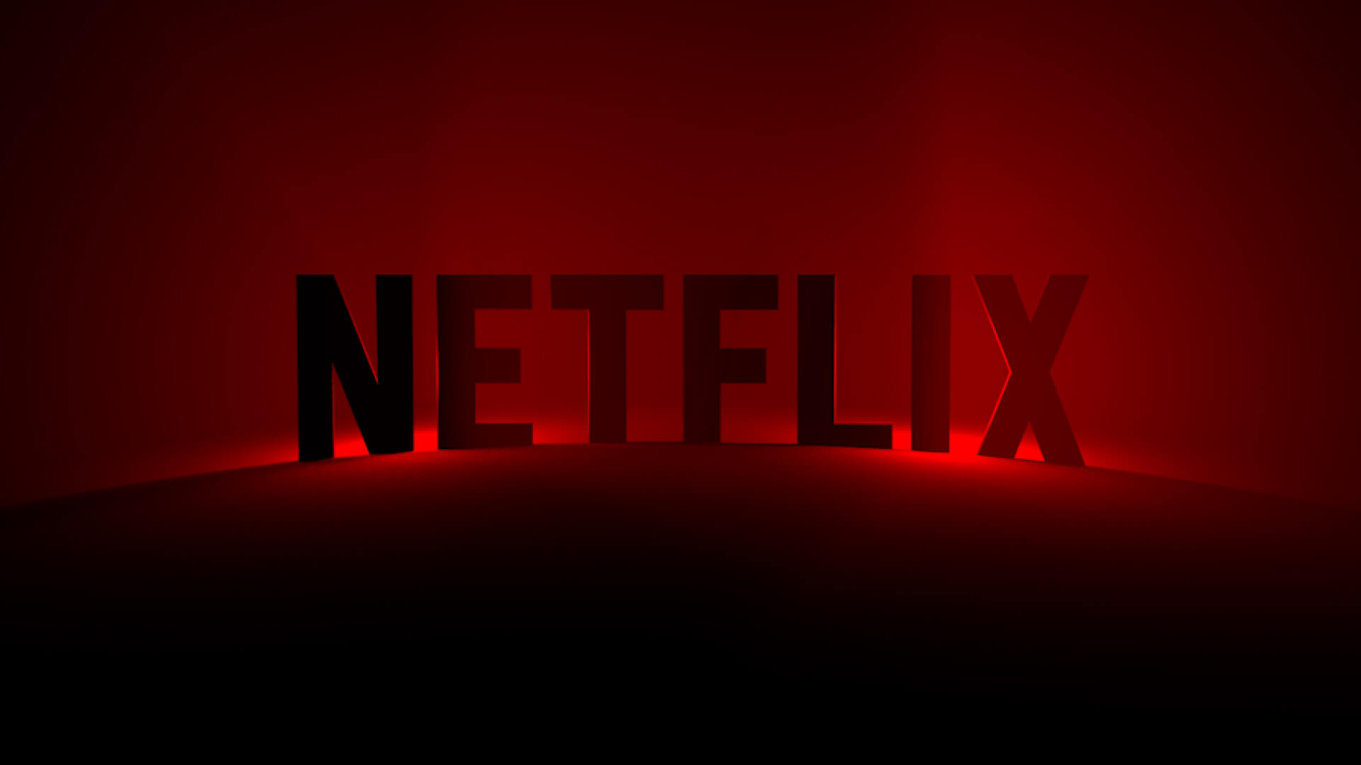
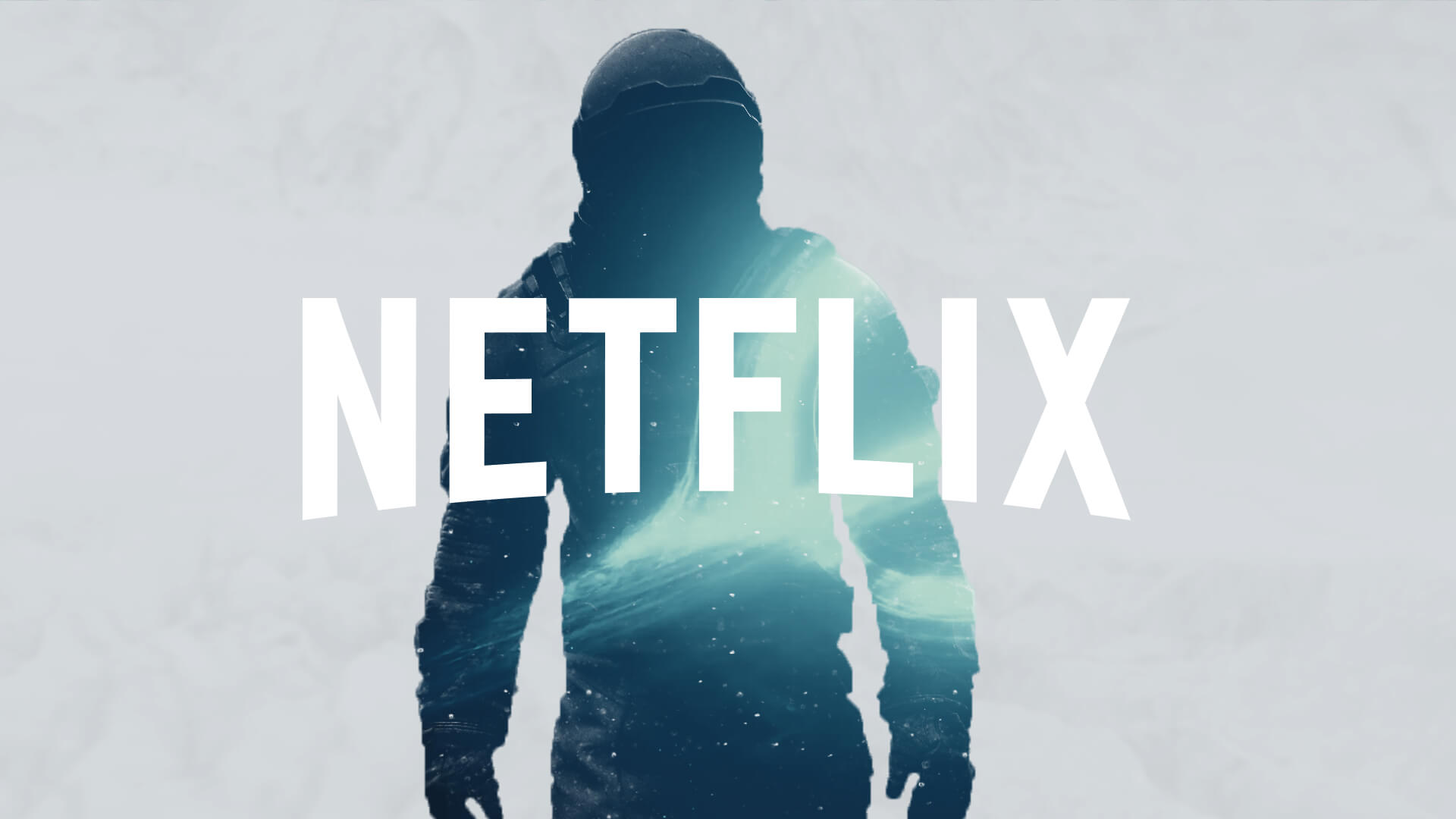
The opportunity was to help move Netflix from where it had been to where it was going. That meant evolving the identity into something more expansive, more cinematic, and more suited to a digital platform at scale. We saw that the arc held the greatest brand equity and recognition. It offered a way to simplify the identity while also making it more ownable and more flexible. From there, we explored how ideas of light, shadow, and motion could help connect the brand more directly to the world of film and entertainment.
Impact
The work helped give Netflix a bolder, more confident identity for its next chapter, one that could scale more effectively across digital touchpoints and growing global communications. It created a stronger bridge between the Netflix brand and the content experience, helping position the company for the platform it was becoming.
Reflection
What mattered most was not simply refreshing the identity, but helping define a brand fit for a major shift in the business. The strongest identities often come from recognizing what already holds equity, then giving it the clarity and flexibility to carry a company forward.